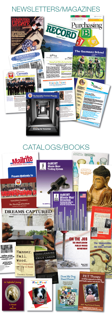

Newsletters, magazines, catalogs, and books. Design and printing production went from X-acto knife to computer in only 30+ years. The computer aids in speed, accuracy and efficiency.
Magazine and newsletter layout is a challenging jigsaw puzzle. Work the grid both vertically and horizontally. Keeping the design integrity doesn’t mean that each page looks exactly the same — variation adds interest. The goal is to make your publication reader-friendly and convey your message in an engaging and professional manner.
In catalog work, the designer has to often fit many products on a page in a way that is still readable and attractive.
Keeping the reader turning the page is not only about how well a book is written. Most people don’t think about how a book is structured with front matter, chapters, and how the pages should look. If you follow design and composition rules, the book flows and reads well.

